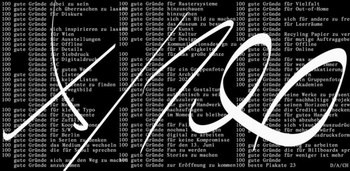
The annual exhibition accompanying the competition for the 100 Best Posters from Germany, Austria and Switzerland presents the latest in graphic design. The winning posters of 2023 are on display for three weeks at the Kulturforum before going on a worldwide tour. Admission to the exhibition is free.
“Expect nothing, appreciate everything” is the appeal made by the Viennese graphics studio Es in its advertising for this year’s competition. In dynamic typography, the black-and-white campaign lists “100 good reasons” for all sorts of things: reasons to participate, reasons to experiment, reasons for creating good design every day, and so on. The 100 selected images are themselves the best reason for visiting the exhibition. “Every poster has its own character, and as in a musical ensemble, they all join together to form a powerful whole”, says jury chair Toan Vu-Huu.
Participation and Jury
The 100 Best Posters from Germany, Austria and Switzerland competition, which has been running since 2000, is judged by an annually changing jury. In its twenty-third edition, a total of 2,333 posters were submitted by 667 applicants. In the two-stage selection process, the international jury ultimately awarded prizes to 45 posters from Germany, 51 from Switzerland and 4 from Austria. The jurors were Sandra Doeller (Frankfurt am Main), Isabelle Mauchle (Lucerne), Flávia Nalon (São Paulo/Hamburg), Tobias Schererbauer (Vienna) and Toan Vu-Huu (Paris).
Drawing with Letters
In this year’s selection, letters and images converge. In many images, type moves in creative forms outside the box, being allowed to meander and cut the queue, tumble and leap, and expand and shrink. Typographical elements such as character lines are used in this diversity of expression – with the poster becoming a drawing in DIN format. An “Echo” fills the space in the shape of a funnel (Lukas Hoffmann); “Heimat” bouncingly requests a local search for clues (Studio Daniel Peter); the title of a theatre piece traces the face of the “Führer” (Neue Gestaltung); and a tender ribbon of artists’ names suggests the silhouette of an alternative design (Enen studio).
Other posters implement the imperfection of faint, handdrawn letters to express emotional states (Studio Mucho Gusto). The traditional play with images as letters can also be found in some designs, for instance, as a bird in the shape of a P (Neo Neo) and as a boot in the form of an L (Sam Steiner), or with entire words being replaced by images – as in a reading primer (Lukas Marstaller).
Colour Power and Photo Graphics
This year’s winning images captivate viewers through their vigorous use of colour. Even when using only two printing colours, powerful statements emerge, for example, in red and pink, purple and orange, yellow and black. Photography also makes a convincing appearance, although always in intimate dialogue with the graphics. When photos serve as the primary image, they are mirrored, inverted, colourised, or graphically processed (nathow & geppert, strobo B M, Sebastian Heß, Pirmin Adolphi and others). The results illustrate the broad spectrum of ways in which photography and graphic design can creatively enrich each other.
Tour
Following the inaugural exhibition at the Kulturforum – Staatliche Museen zu Berlin, 100 Best Posters 23 goes on tour through Germany, Austria and Switzerland, as well as to Korea and other locations, beginning in July 2024.
Publication
The exhibition at the Kulturforum in Berlin is accompanied by the yearbook, 100 Beste Plakate 23, including all of the winning images. It was published in collaboration with Slanted Publishers, Karlsruhe, and designed by Studio Es, Vienna. Details are available on the 100 Beste Plakate e. V website.
A special presentation of 100 Beste Plakate e. V. in collaboration with the Kunstbibliothek – Staatliche Museen zu Berlin
Source : Museen zu Berlin


