Henry Ford is frequently quoted as saying his Model T was available in “Any color the customer wants, as long as it’s black.” Apple has often been accused of taking this approach to its products, with the original iPhone only available in one finish. Over the years, of course, iPhone color choices would expand… to white, then adding silver, gold, and eventually all sorts of shades.
The iOS experience has followed a similar route, at first offering almost no way to customize your phone other than to reorder the app icons, but eventually allowing wallpapers, folders, widgets, lock screen images, and more.
The iPhone has always had far fewer customization options than Android phones, and that’s still true today, but Apple is starting to really embrace personalization. The widgets and app library of iOS 14 were a big step forward. Custom lock screens gave us another big leap in iOS 16. And with iOS 18, Apple has given users the ability to change the look and feel of their iPhone more than ever before.
Here are all the major ways you can personalize your iPhone to make it look and act the way you want to without needing to download a single third-party app.
iOS 18 customization: Home screen
At the time of this writing, iOS 18 is still in beta, but we already know how its new Home Screen customization features will work. Here are the new ways to personalize your iPhone’s main screen in the big update coming in the fall of 2024.
Icon placement
You’ve been able to reorder the icons on your home screen for ages, but with iOS 18 you can put them anywhere on the grid, leaving as much empty space as you want.
Press and hold on an empty area of the home screen until the icons jiggle to enter edit mode. Then just drag your icons wherever you want. You can even tap additional icons after you start moving one (using a second finger) to grab a group and move them together.
You can also drag an app icon on top of another one to make a folder, which can be placed wherever you’d like. You can name the folder, and drag other icons in and out as desired.
For more, see our article How to put app icons, widgets, and folders anywhere you want.
Foundry
Icon size
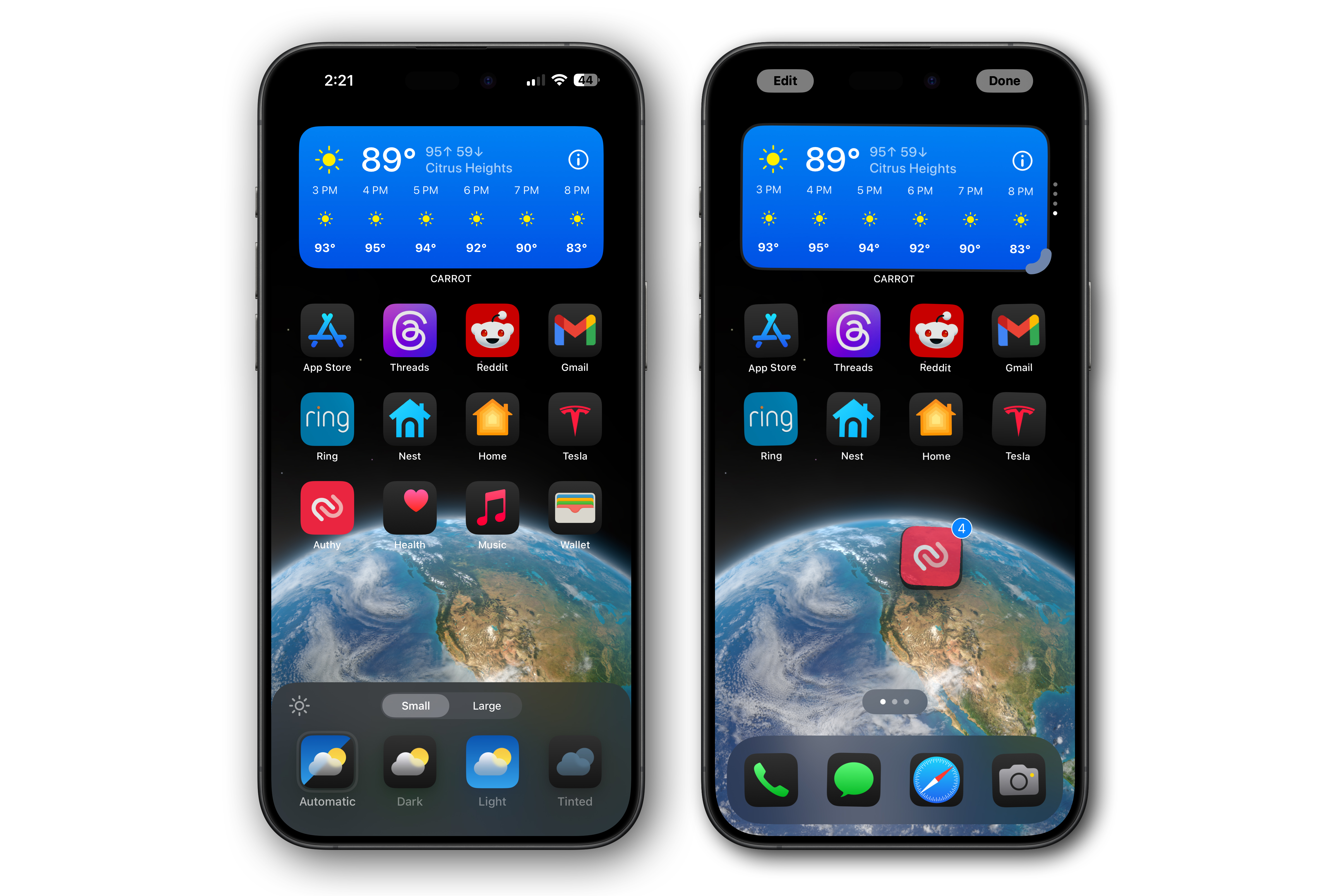
iOS 18 lets you make your Home screen icons bigger—it just scales them up, removing the icon names, so the grid size remains the same.
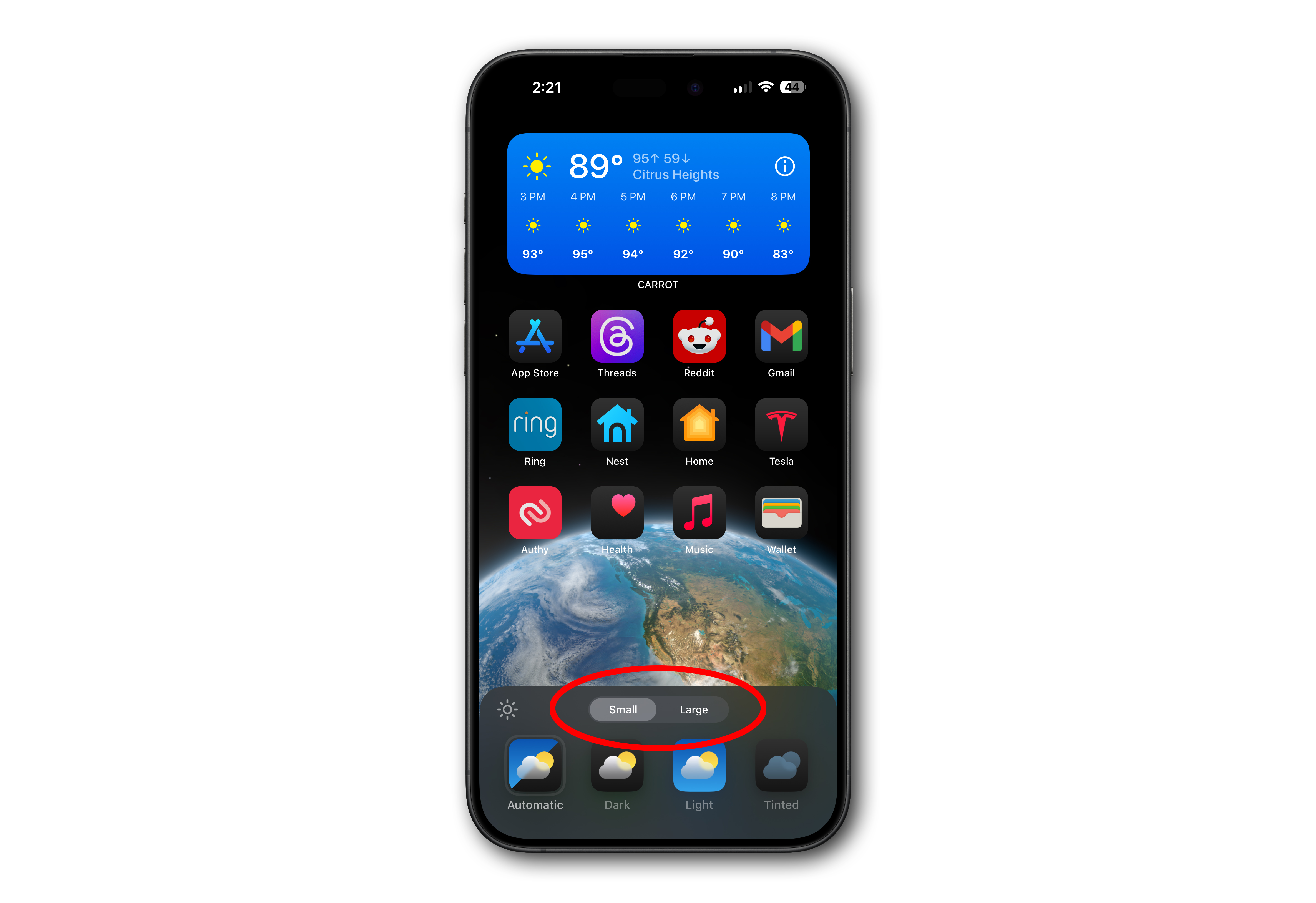
It’s a clean look and it’s easy to do. Put your Home screen in edit mode (long-press an empty area until the icons jiggle), then tap the Edit button in the upper left, then Customize.
Select Large from the icon options menu that pops up at the bottom of the screen. Tap Small to go back to the original size.
For more, read: How to make your app icons large and label-free.
Foundry
Icon color and dark mode
That same menu from the last tip also lets you change your icon colors. Automatic will show light icons when your screen is in light mode and dark icons in dark mode. But you can force light or dark icons all the time by tapping the appropriate buttons.
The Tinted button allows you to automatically tint all your icons to a single shade. A tint color is automatically suggested based on your wallpaper image, but you can pick any hue and brightness you want. There’s even an eyedropper tool to let you exactly match one of the colors on your wallpaper.
For more info, read: How to change the color of the app icons on your home screen
Widgets
In addition to the four limited widget spots on your Lock screen, you can add lots of interactive widgets from apps directly to your Home screen. These were added in iOS 14, and while the capabilities of widgets have grown in later releases, using them remains more or less the same.
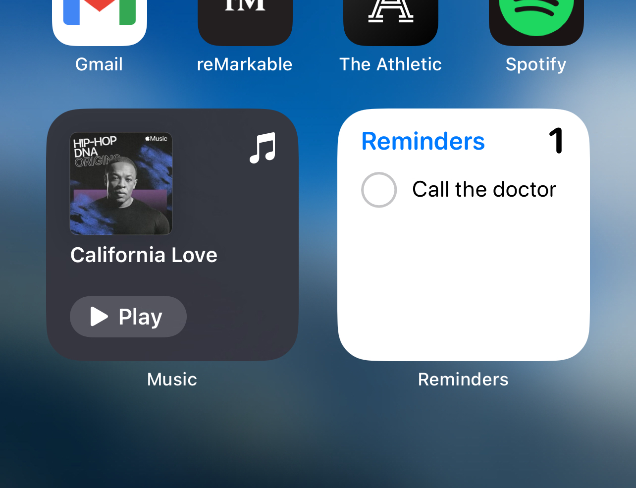
In iOS 18, you can resize widgets by dragging them and make them appear larger by removing the text beneath,
Tap and hold an empty space on your Home screen until the icons all wiggle. Then tap Edit in the upper left corner of the screen and select Add Widget. You’ll see a list of various widgets, many of which have different display options and sizes. You can reposition these widgets just as you would app icons, and even drag them on top of each other to form a “smart stack.”
For more, read: How to add, remove, and customize widgets.
Henry Burrell / Foundry
Pages and apps
There are many ways to organize your Home screen–you don’t just have to deal with page after page of app icons.
Start with a tap-and-hold on an empty space on your Home screen until the icons all jiggle. You can tap the (-) button in the upper left of any icon to delete that app or to keep the app but remove the app icon from your Home screen. You can also tap the dots near the bottom of your screen to see thumbnails of all of your Home screens. From there you can hide entire screens from view.
You can apps that are hidden from view in the App Library or via Spotlight search.
iOS 18 customization: Control Center
You’ve always been able to customize Control Center a little in the settings, but iOS 18 lets you take it to the next level.
Swipe down from the upper-right edge of your iPhone to open Control Center, then tap and hold on an empty space to enter Edit mode.
Here you can rearrange controls, tap the (-) icon in the upper left corner of a control to delete it, or drag the bottom-right corner of a control to resize it.
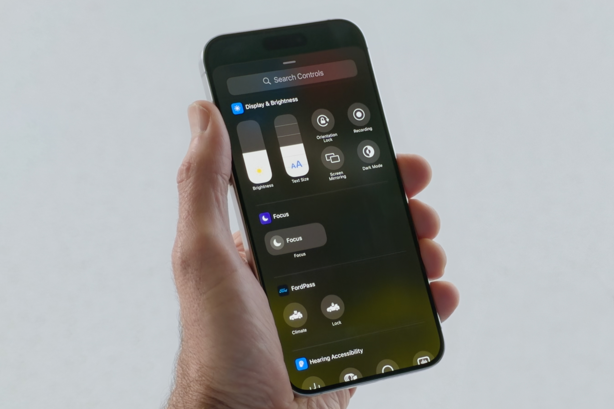
Tap Add a Control at the bottom of the screen to add a new control. You can make some controls so big they take up entire pages!
Swipe up and down to switch to additional control pages. You’ll find lots of new controls in iOS 18, and for the first time, third-party apps will be able to add their own Control Center controls as well.
iOS 18 customization: Lock Screen
Flashlight and Camera. Those have been the two controls on your Lock Screen forever, and there was nothing you could do to change it…until iOS 18. Now you can change both of the controls to almost any Control Center control!
Tap and hold on the Lock Screen, then tap Customize on the bottom. Choose Lock Screen rather than Home Screen.
From this screen you can adjust your time and date widgets, the row of widgets beneath them, and yes, the two controls on the bottom left and right corners. You can tap (-) to remove them and replace them with dozens of different Control Center functions.
Apple
With iOS 16, Apple made a big change to the iPhone lock screen—you can customize the time display, choose custom widgets to provide at-a-glance info, and of course, choose the wallpaper you want with a cool depth effect.
Start by long-pressing your lock screen to enter into the edit mode. You can swipe side to side to switch to different Lock screen setups and tap Customize to change your Lock screen time, date, and widgets.
For more, check out: How to customize your Lock Screen with widgets and wallpaper styles
iOS 18 customization: Other features
While the latest version of iOS adds some big new ways to personalize your iPhone, there are also some older customization options you might not know about. Some are highlighted above, but here are a couple of older customization options.
Action button
With the iPhone 15 Pro and Pro Max, Apple replaced the mute switch that has been in place since the original iPhone with an Action Button that you hold down to perform one of eight actions, including turning on the flashlight, launching the camera, and translating speech.
Those options are still there, but in iOS 18, the list of functions has greatly expanded with the inclusion of a new “Controls” option. This lets you choose one of the Control Center controls as the function of your Action button: Quickly enable Airplane mode, open Calculator, record a quick note, scan a QR code… there are lots of possibilities.
Open Settings, and select Action Button from the main menu. Just swipe through the options to pick the one you want.
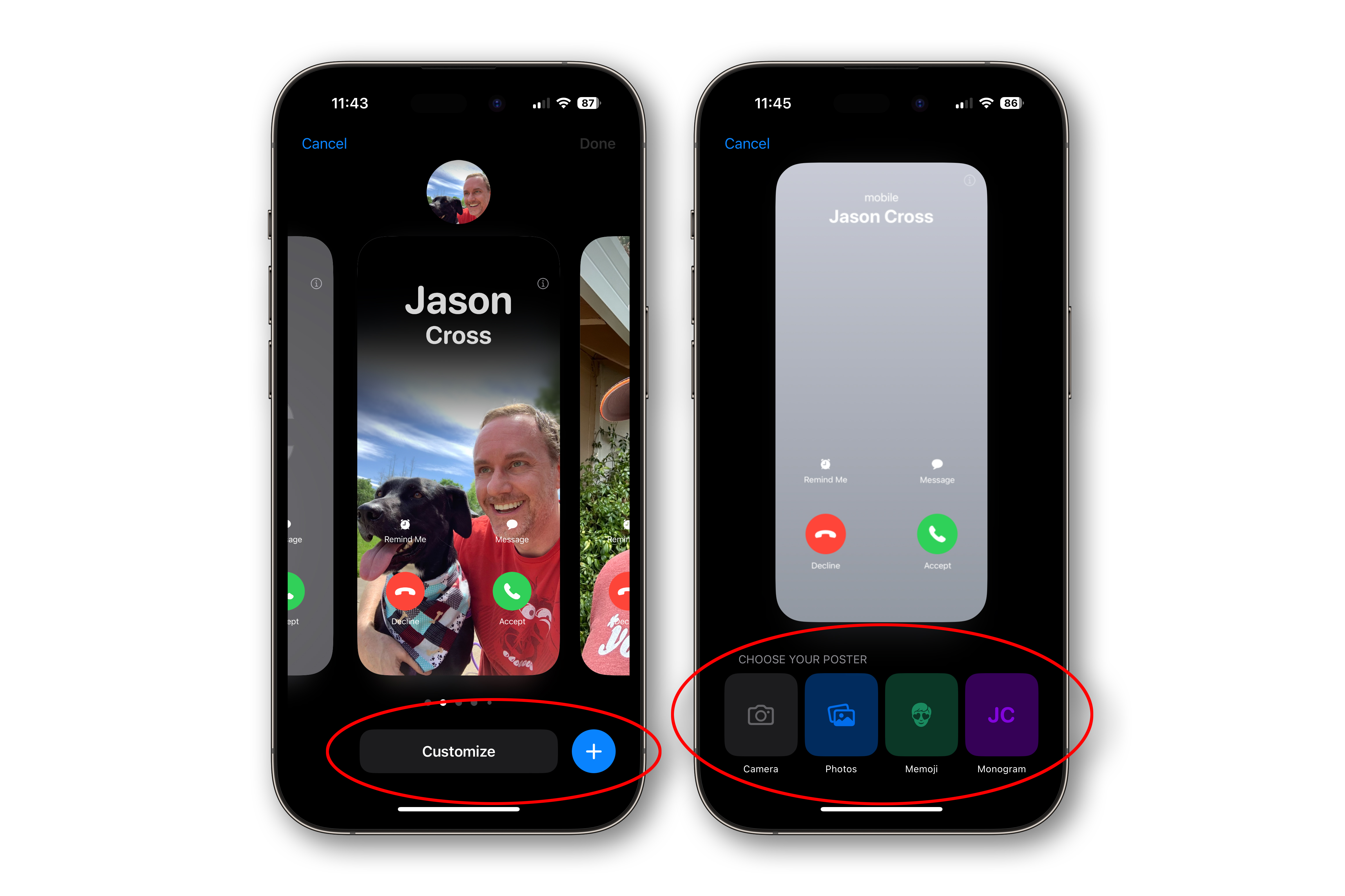
Contact poster
Starting with iOS 17, you can create a new custom “contact poster” that will show up on other iPhone users’ devices when you call them and will appear on your entry in their Contacts.
Start by opening your own Contact card–either in the Phone app or Contacts app–and look for the Contact Photo & Poster entry under your picture. Tap that to get started creating your custom contact card.
In the Contact Poster creator, you’ll also be able to choose one of two options, either Contacts only so your contacts will always see your custom poster, or Always ask, which will prompt you to share it every time.
For more, read: How to create and customize your Contact Poster in iOS 17.
Foundry
Back Tap
Though not a traditional iPhone personalization option, the Back Tap accessibility feature lets you assign a function to a double-tap or triple-tap of the back of your phone. It’s sort of like having an invisible button on the back of your iPhone and can be very helpful.
Open Settings, then tap Accessibility, then Touch. Scroll down and select Back Tap. Here you can choose a function or feature to turn on when you double-tap the back of your phone and another one when you triple-tap.
For more, read: ‘Back Tap’ feature in iOS 14 turns rear of iPhone into a button.
Source : Macworld


